
AI18: BTS of designing websites for AI products
From meh designs to a few that I'm proud of.


For the past week, I have been designing a website for our upcoming product.
I’m not a designer by trade, and frankly I’m still developing my taste. But in the spirit of “you can just do things”, I dove in head first, like I always do.
Over the past few years, I have been able to improve my designs and create websites that don’t look too ugly, such dashibase.com and pebblely.com, thanks to SK’s feedback.
I love watching professional designers share their thought process as they are designing and improving designs, such as Brian Lovin’s Crits. So, I thought it might be valuable to document our process for my future self and others.
My initial designs were terrible but thankfully after several iterations, I created some that I’m proud to share. If you are impatient, you can scroll to the end for the latest iteration.
(Sadly, Substack compresses the images, so the images don’t look as sharp.)

Behind the scenes of my creative work
Before jumping into Figma, SK and I had a quick chat about the styles and vibes we might want. As a starting point, we wanted the brand to feel more human than mechanical or digital, even though we are building an AI product. We believe in AI augmenting humans rather than replacing humans. Humans are the craftspeople; AI is the tool. Visually, we don’t want the overly-used minimalistic black-and-white design that most software companies use nowadays.
Based on that, I searched the internet for references. Godly and Httpster have a good collection of websites. I also tried ChatGPT o3. While it went through many websites, it didn’t bring up websites with the styles I had in mind, even when I shared some examples. But it could articulate the styles in ways I couldn’t, and that helped me in the third iteration.
First iteration: Explore 9 possible directions
I have a bad habit of focusing on only one design and failing to explore alternatives. So, this time I forced myself to first come up with nine quick designs with fairly different directions.

One and three look promising. Two a little; the metaphor in the design might be lost. Four, seven, and eight look like cheap Apple. Five is too bland. Six’s colors don’t work. Nine’s colors are okay but not great.
But these were just a small chunk of a website and the full website could look and feel very different.
So, from here, I created the full website designs for one, two, and three.
Second iteration: Focus on 3 promising directions
I was supposed to focus on three directions (simple, analog, neobrutalism).
But I mixed them. The designs, as you can see below, felt neither here nor there. One and two are supposed to be simple but I added illustrations (analog) and random shapes that aren’t analog. Three and four are a mix of analog and neobrutalism. Four and five look okay but don’t actually match any of the directions.

Disappointed by these designs, SK advised me to push the styles to the extreme. Upon reflection, I realized I was using conventional website designs and adding tiny elements of the desired style.
They look ugly.
Third iteration: Go to the extreme
After a walk and lunch with my wife, I identified four styles and researched what they really mean:
Minimalistic and human-centic
Analog and organic
Retro digital
Neobrutalism
Like I mentioned above, ChatGPT was helpful in describing the styles and highlighting the key elements, which allowed me to emphasize them in my designs. For example, for retro digital, I used pixelated fonts, pixel art icons, and recreated the early Mac window frame.
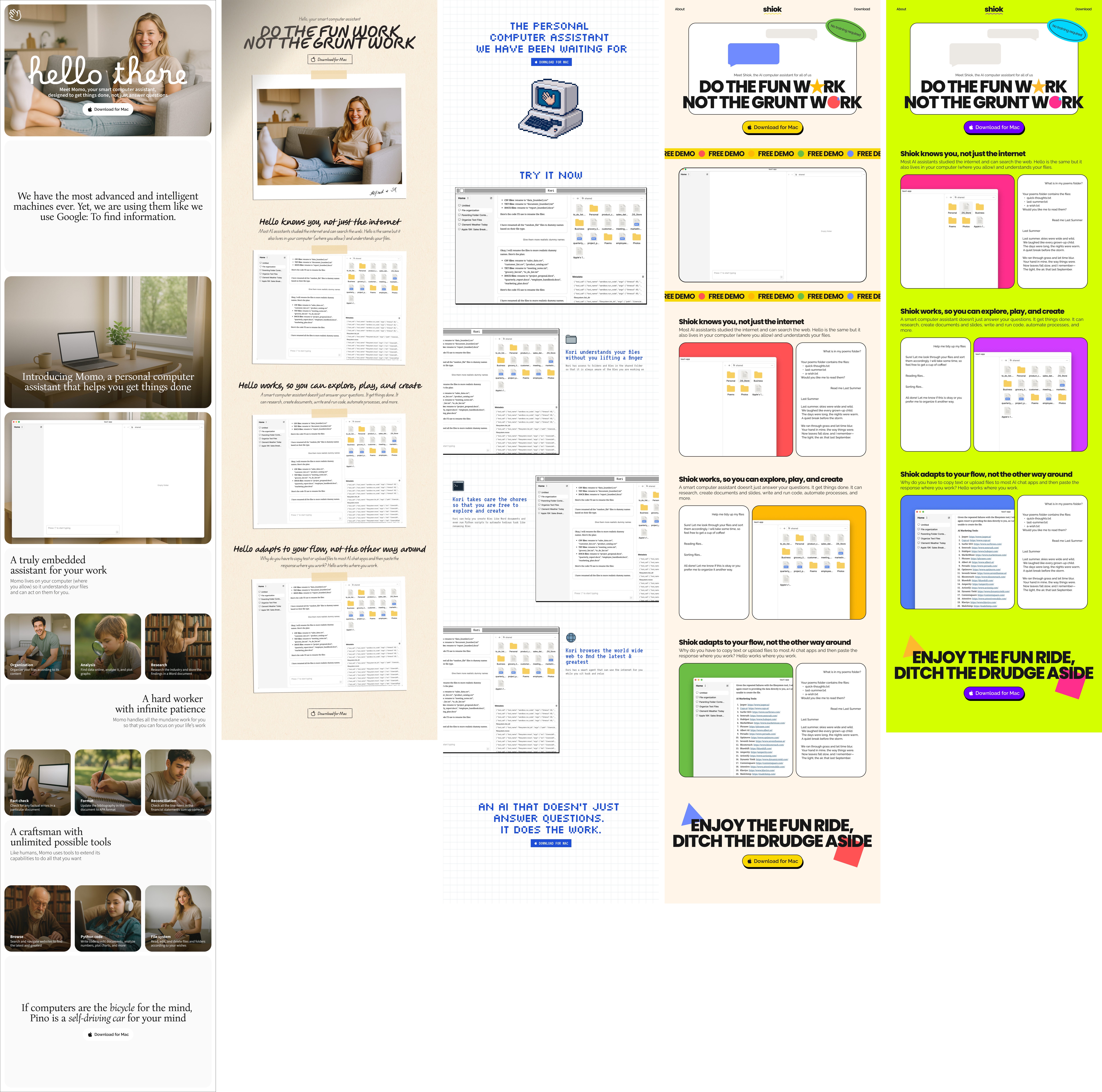
Two is too analog and doesn’t feel right for a software product. Three is nice and likely attractive to a niche group of people but it might be hard to evolve the brand later. Five feels way too much.
One and four are the better ones from this iteration. But one feels too plain and four feels too playful.
Fourth iteration: Create variants of the better options
Throughout the process, we slowly defined the branding and visual identity we want with more specificity.
Human-centric, friendly, and welcoming
Professional but not corporate
Playful but not too casual
Not just black and white
In this iteration, I experimented with adding some colors to the minimalistic and human design and toning back on the extreme colors and shapes for the neobrutalism design.
In case it’s not obvious, all the photos, pixel art icons, and illustrations in the third and fourth iterations were generated using ChatGPT. For photos, I used Canva to add the same filter so that they give the same vibe. For pixel art icons and illustrations, I used PhotoPea to remove the background.

My favorite at this stage is four because it’s less conventional and has a distinct style. It feels playful but also serious enough. That said, one feels the safest, albeit plain.
Which is your favorite, and why?
(P.S. The copy still needs a lot of work. But I’m curious if any phrases stand out to you!)
Jargon explained
Missing logs
This week, I ran into a bug but there were no logs for me to debug the issue.
The reason was that the function was run in a subprocess, not the main Python process. So any logs were printed in that child process and wouldn’t show in the main console, unless I pipe the logs out of the subprocess and then read and print them.
I still need to try this out. For future reference, here’s my conversation with ChatGPT on this.
Interesting links
I was mostly reading about design and branding this week.
Creating the world’s first community-driven superbrand (Airbnb)
Seamlessly crafting AI branding and visual identity for Anthropic


